There is so much to discover about blue that I could easily devote three months of the podcast to it, but I won’t do that to you (and me).
For this special weekend edition I’m sticking to some of the most fascinating facts about blue.
Did you know that there are no blue eyes, and that there is almost no real blue in nature?
What we see as blue is actually the result of a clever way of refracting and absorbing light waves by crystal grids and other constructs.
Have a look at this brilliant YouTube movie which explains how this works (and shows you some stunning morpho butterflies in the process).
I now know that Kramer’s Eye is, in fact, not blue, but translucent.
Yet there are minerals which are naturally blue, and the more stable ones ended up as pigments on the artist palette. You’ve probably heard of ultramarine and cobalt blue.

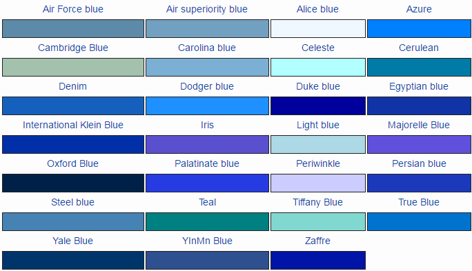
YInMn Blue by Mas Subramanian, CC BY-SA 4.0, https://commons.wikimedia.org/w/index.php?curid=49854366
But how about YInMn Blue?
This deep blue pigment was serendipitously discovered in 2009.
More stable than ultramarine, and without the toxicity of cobalt blue, it might become a very popular pigment both in art and industrial applications. And the story of its discovery is well worth checking out - you can find Mas Subramanian’s Ted Talk here.
YinMn Blue is brand new - but one of my personal favourite uses of blue was invented back in the 19th century: the cyanotype.

This photosensitive blue, initially used only for blueprints, was first used to create photographs by Anna Atkins, in 1843, making her the first female photographer.
An entire book of her Algae prints was recently acquired by the Rijkssmuseum in Amsterdam and you can download them in high resolution in the Rijksstudio. If you’ve never heard of her, or seen her work, I highly recommend checking it out.
Which brings me to the creative part of this weekend edition
What can you possibly do with blue? Here are some ideas.
1. Blue Buckets
Categorise your daily blues. Take pictures of all the blue stuff in your life and organise it in different ‘buckets’; e.g. good blue, bad blue, or neutral blue.
Or make up your own categories, e.g. like ‘happy blue’, ‘playful blue’, ‘bored blue’, etc. You can ask family members to do the same and compare your sets of blues and corresponding ‘values’.

I like this blue hue!
2. Personal Pigment
Design your own blue - If you could design your own blue pigment, which colour blue would it resemble? Use the Google colour picker to find your favourite hue, and then think of the perfect name for it.
3. Blue Hunting
Go on a blue treasure hunt in a museum. Look for blue in all the art works, and try to figure out what type of pigment was used.
4. Cyanotypes
And of course if you can get your hands on some cyanotype paper, go create your own beautifully blue photo prints.
Have a beautifully blue weekend, and do share your creations on Twitter or Instagram using the hashtag #kramerseye.